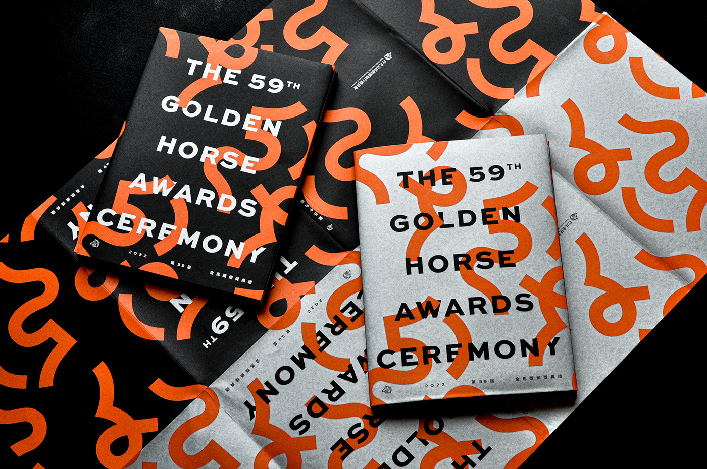
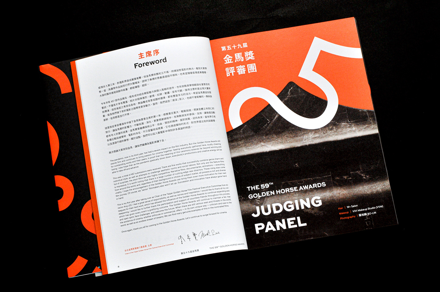
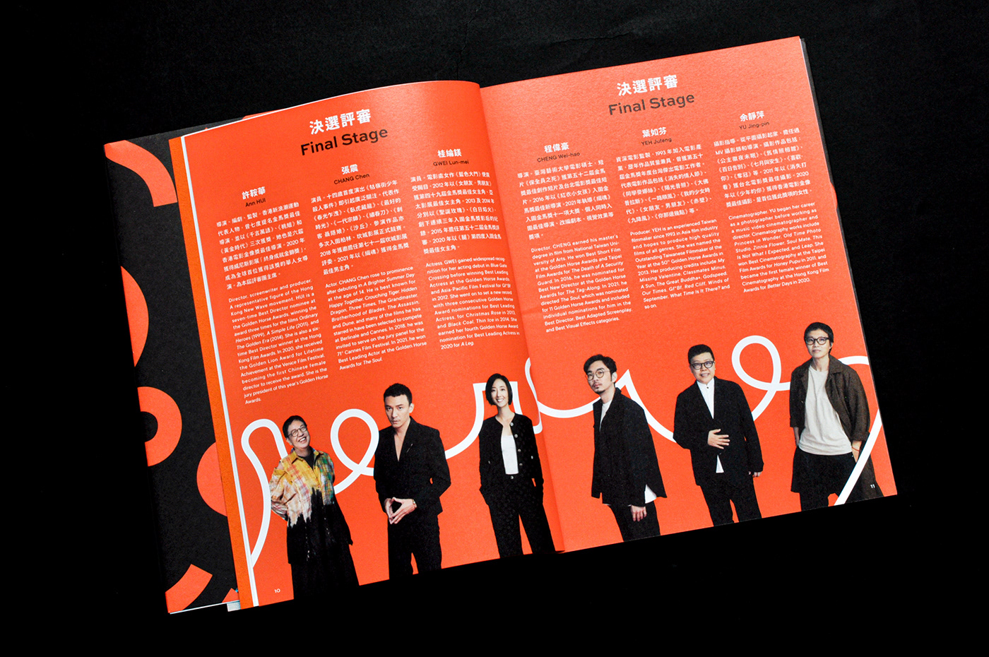
第 59 屆金馬獎頒獎典禮 場刊
設計理念
首先關注如何將金馬59年度視覺,極致轉換於平面應用中;再則刻意以收斂節制、輕量化的設計手法,降低設計干擾,回歸文本的最佳呈現;最終細選適材適性的紙張與印刷加工,展演紙本特質。
首先關注如何將金馬59年度視覺,極致轉換於平面應用中;再則刻意以收斂節制、輕量化的設計手法,降低設計干擾,回歸文本的最佳呈現;最終細選適材適性的紙張與印刷加工,展演紙本特質。
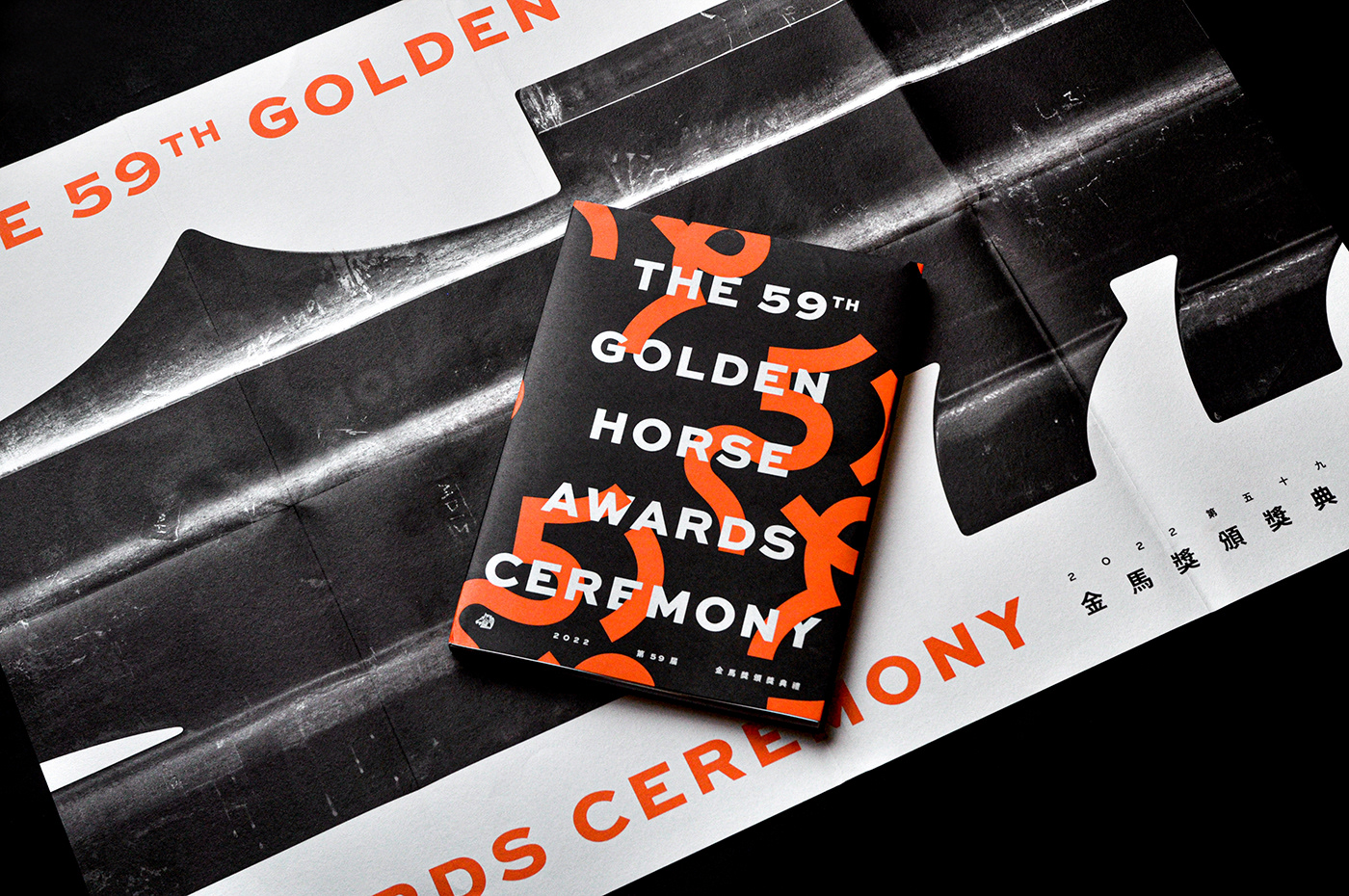
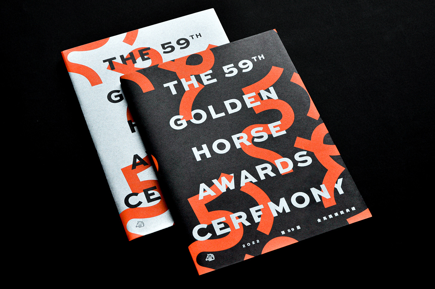
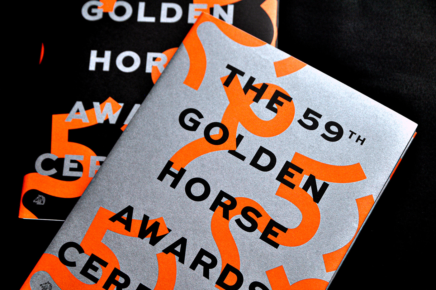
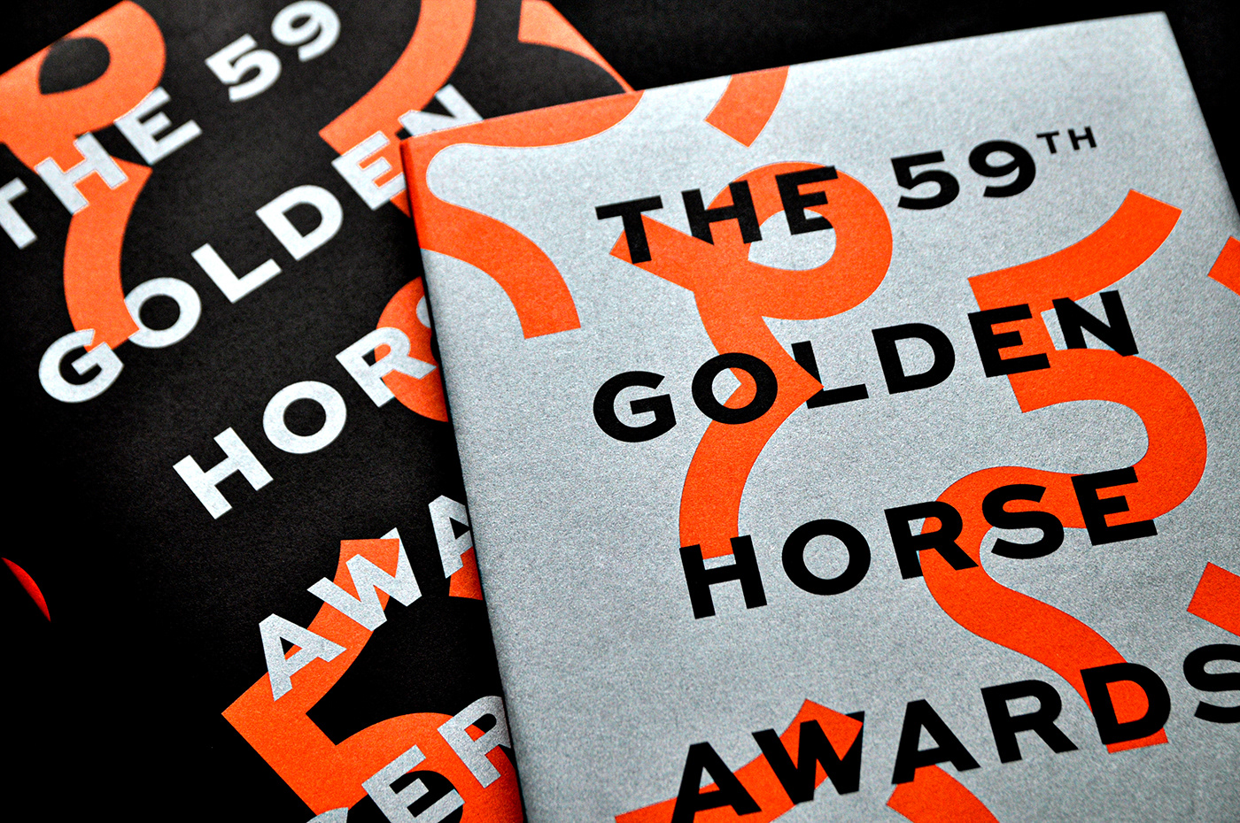
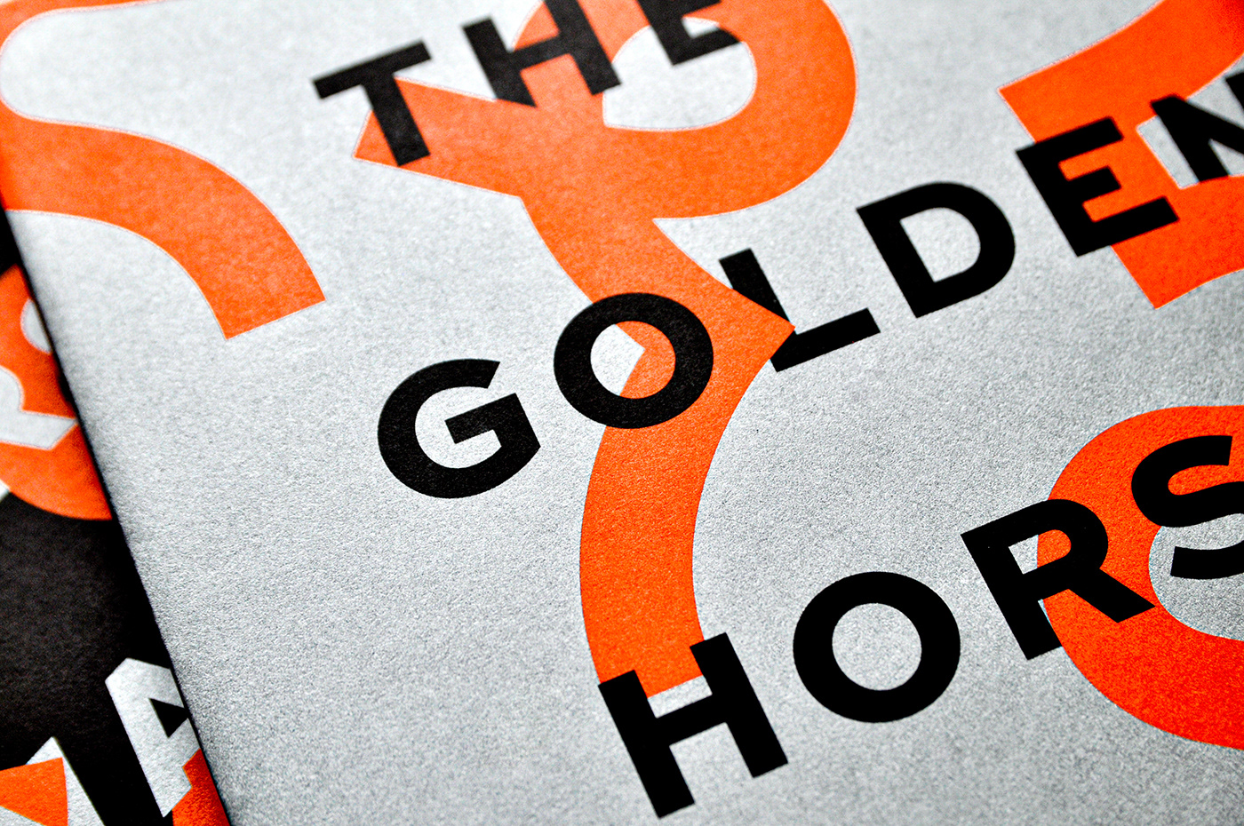
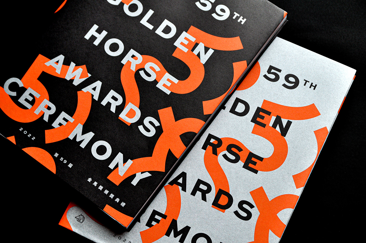
場刊封面
銀/黑雙封面大書衣形式,開展後為全幅的金馬59主視覺,豐富視覺變化與增加收藏價值。
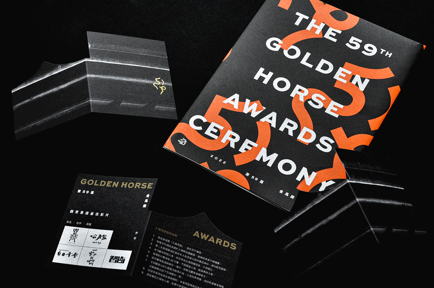
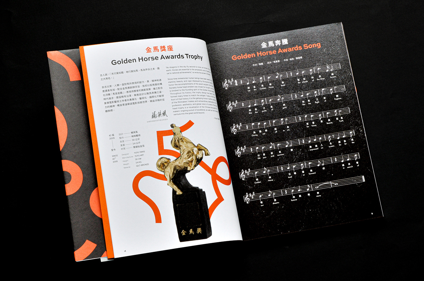
場刊內頁
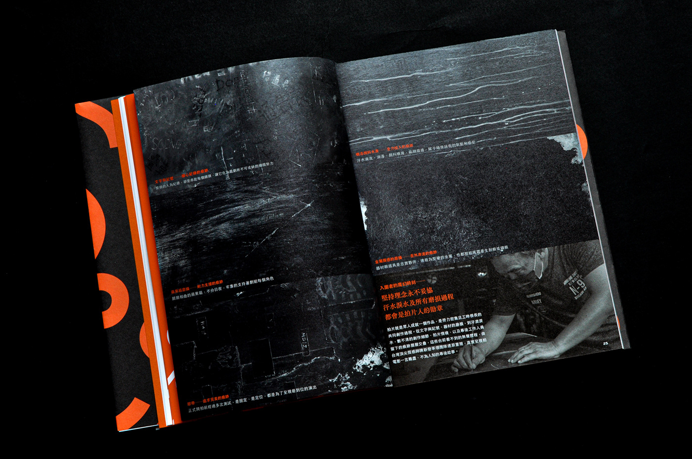
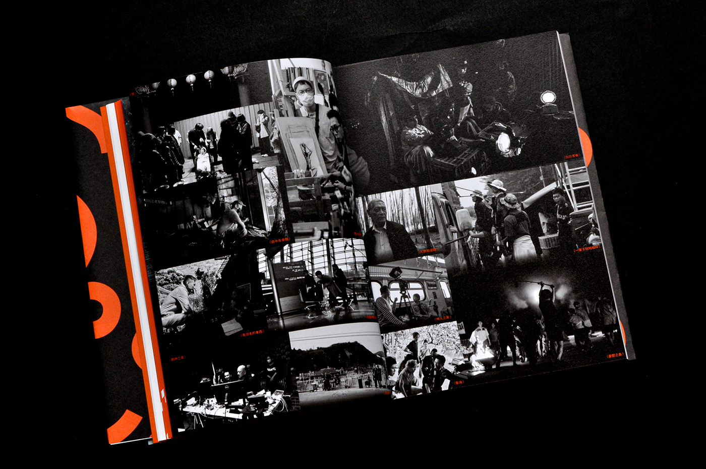
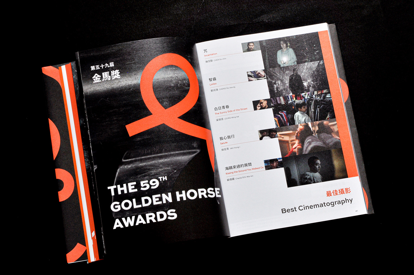
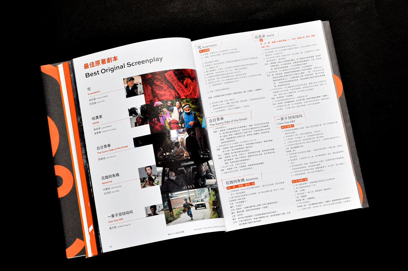
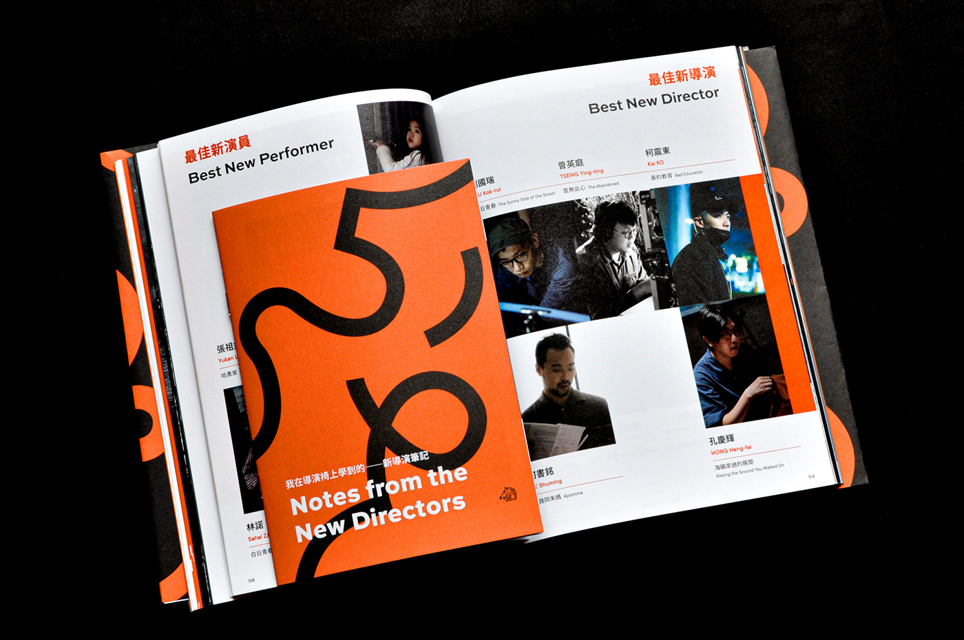
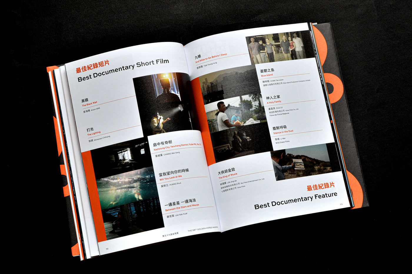
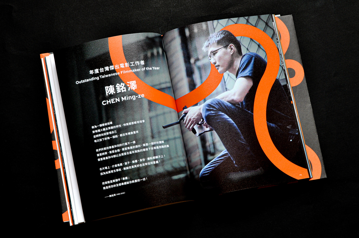
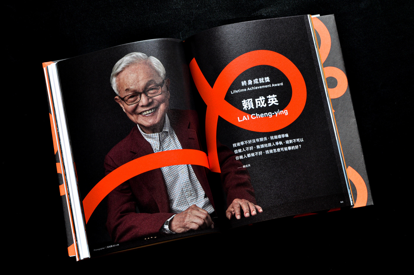
以痕跡圖像與59 Logo線條貫串,全冊以白底為主友善閱讀、橘色為亮點操作、黑色則用以尊榮重量級內容;裝幀結構以拉頁接續表現「最佳美術設計」入圍作品、「新導演筆記」則採別冊形式與紙材差異,呼應內容的層次也創造閱讀的節奏。
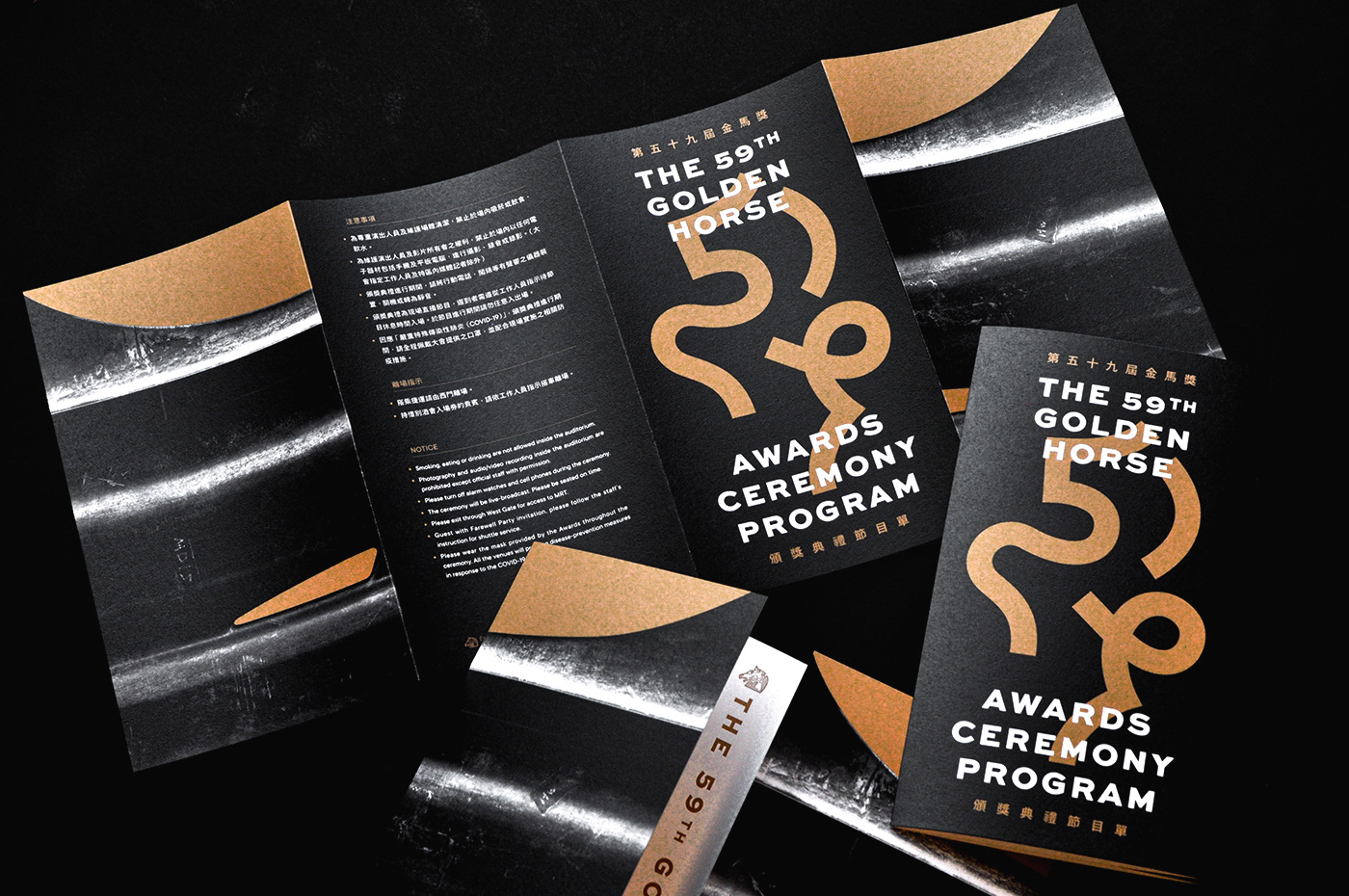
節目單
開門折結構詮釋由2D視覺進入節目現場
入場憑證
單純的刀模設定展現金馬59的視覺之美
The 59th Golden Horse Awards Ceremony Program
Focus on how to transform the Golden Horse 59 Visual elements into graphic applications; deliberately use restraint and lightweight design techniques to reduce design interference and return to the best presentation of text; carefully select suitable paper and printing processing , showing the characteristics of paper. Silver/black double-cover book jacket form, after the development, it will become the main visual of Golden Horse 59 in full size, enriching visual changes and increasing collection value.
金馬59主視覺:Bito
印刷協力:沈氏印刷
印刷協力:沈氏印刷