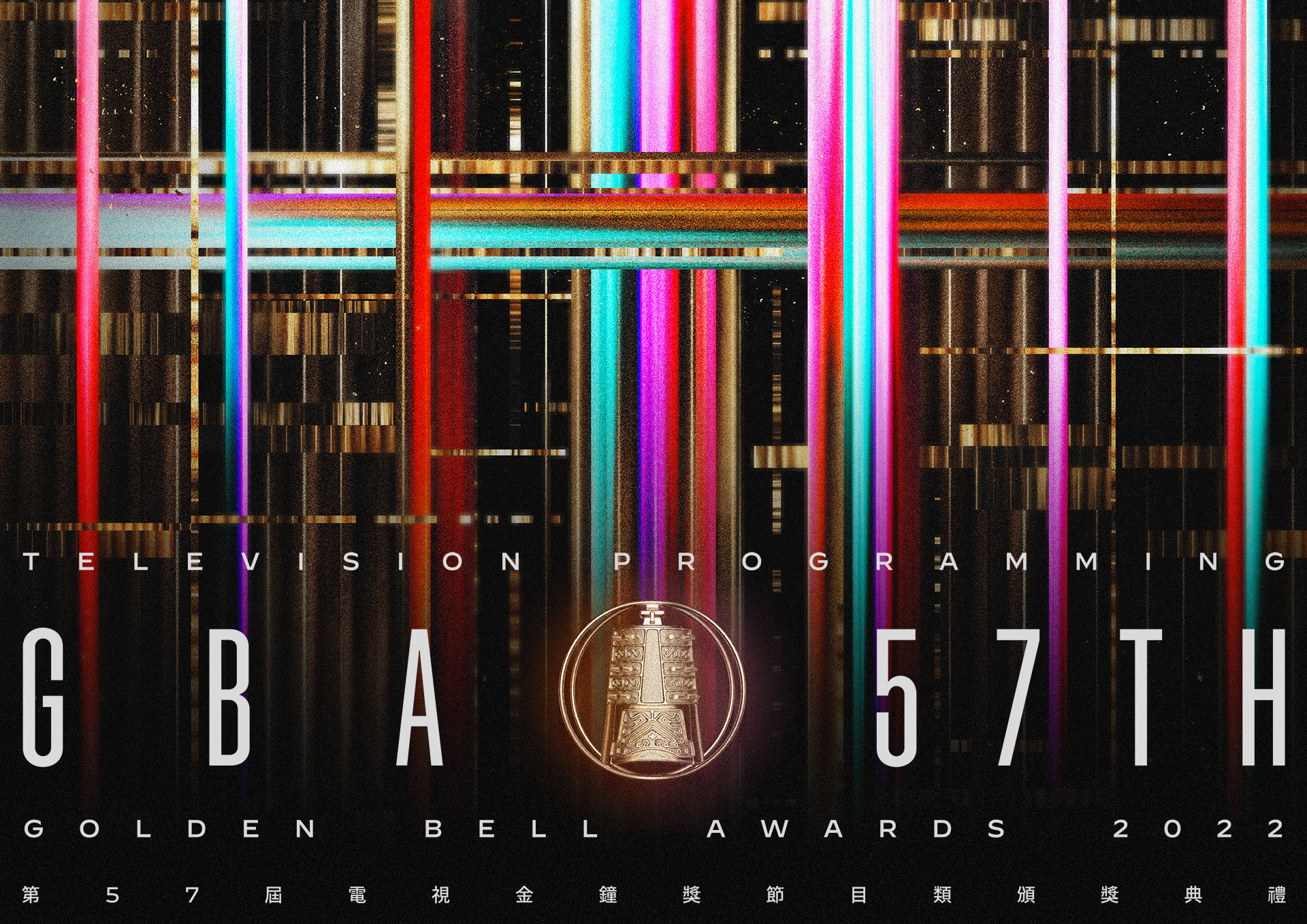
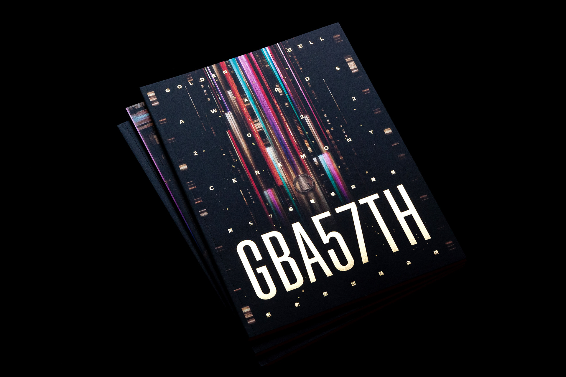
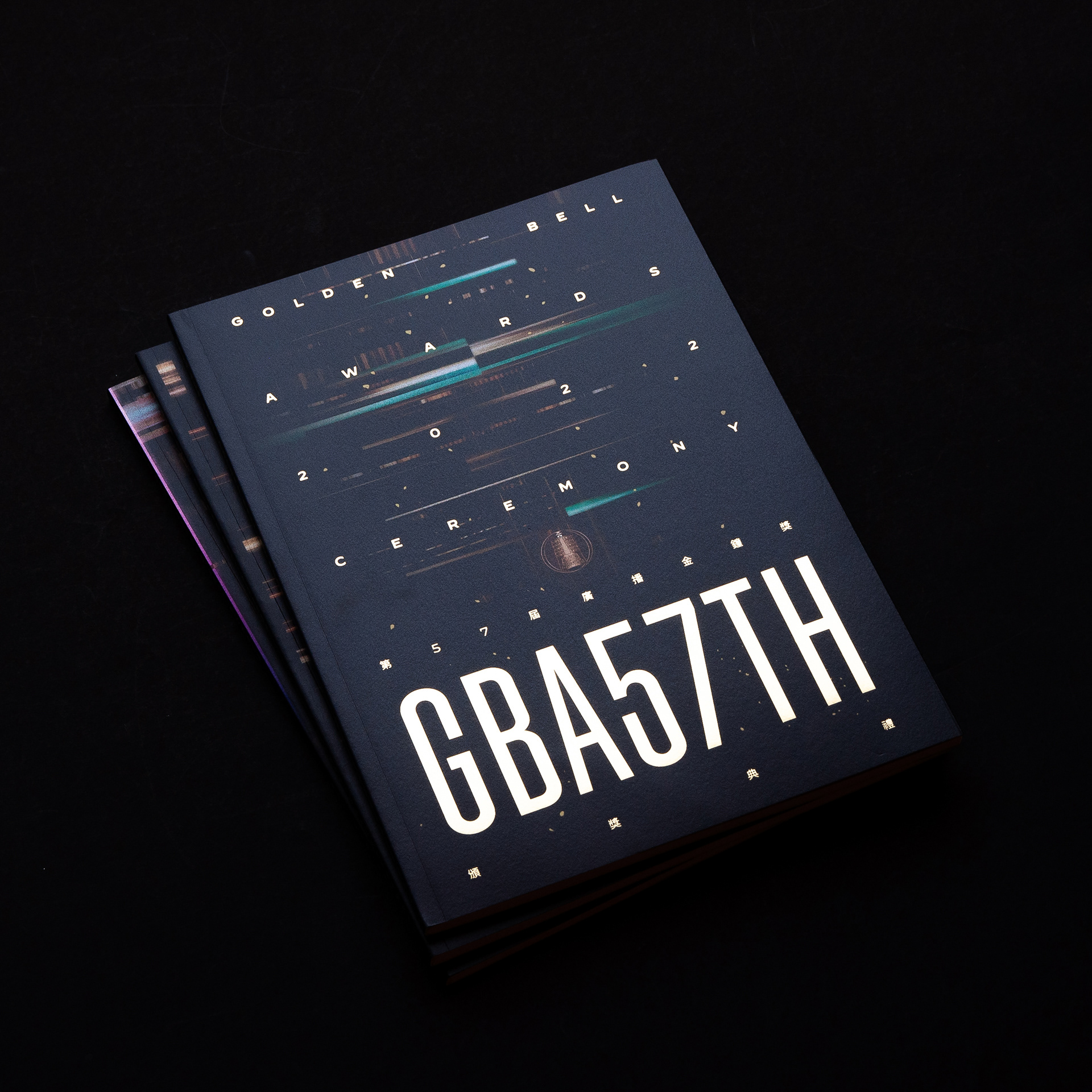
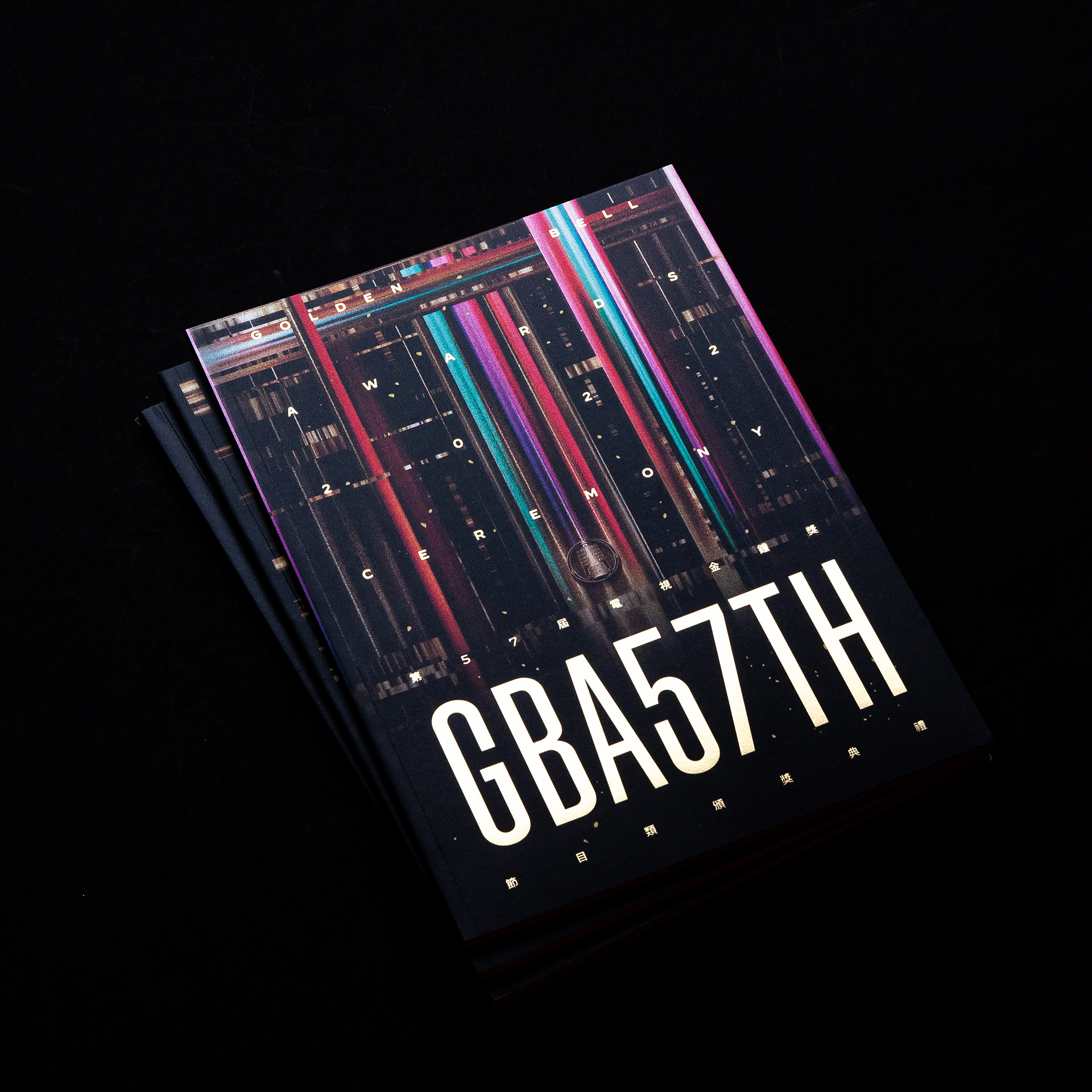
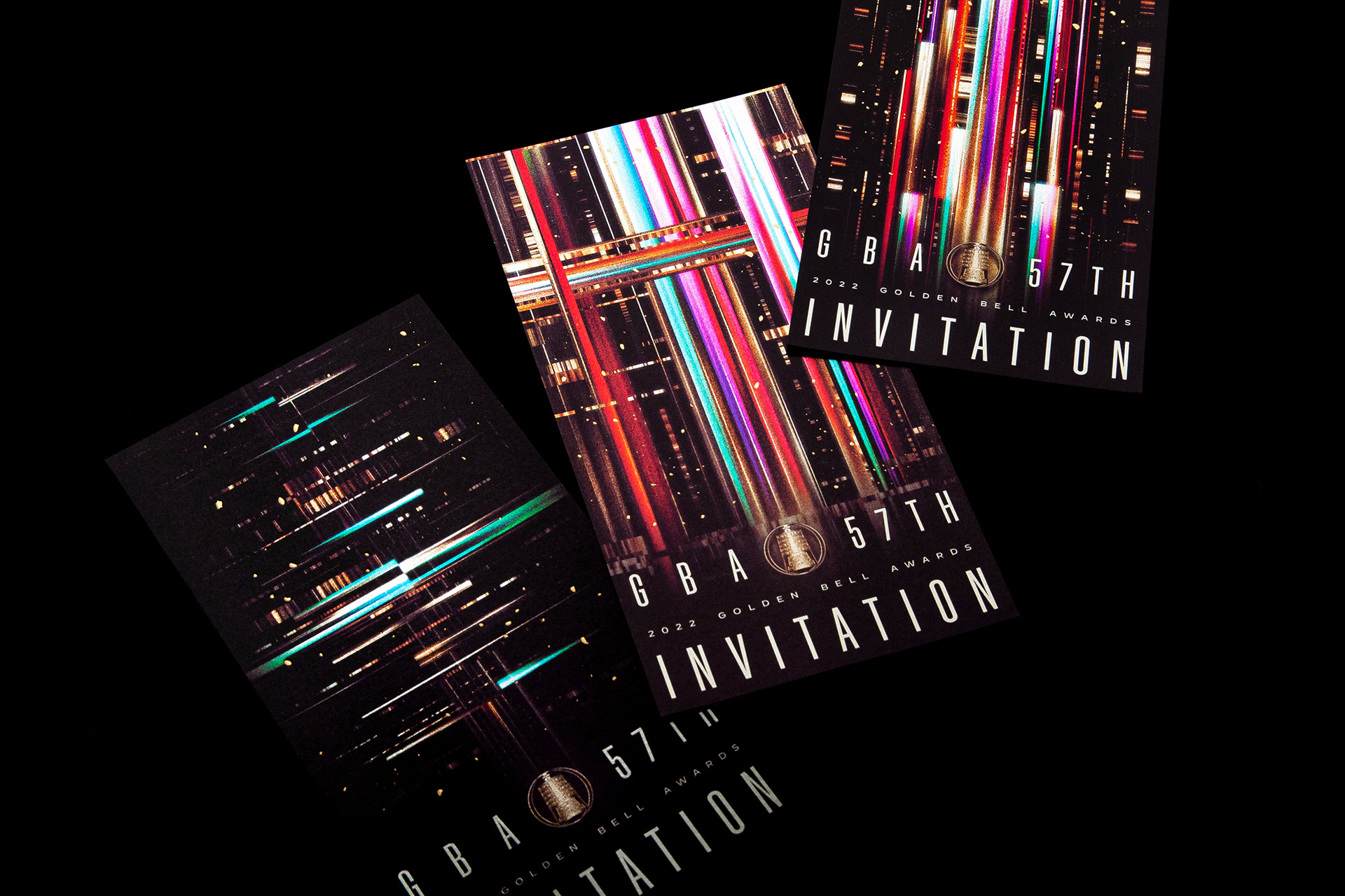
第 57 屆金鐘獎
金鐘品牌 ICON 創建
規劃目的在年輕化金鐘獎,為金鐘建立品牌輪廓,強化應用的廣度。取材獎座上的「鐘」紋理為基礎,用扁平化手法、理性線條、完美對稱造型,賦予金鐘簡約與當代性,用以開啟更多元的設計、加工與行銷應用可能。為金鐘獎建立核心品牌識別,利用經典識別累積獨特的品牌價值。
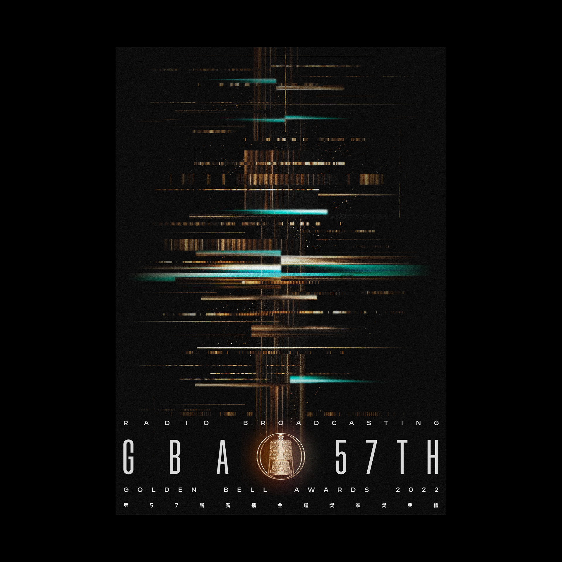
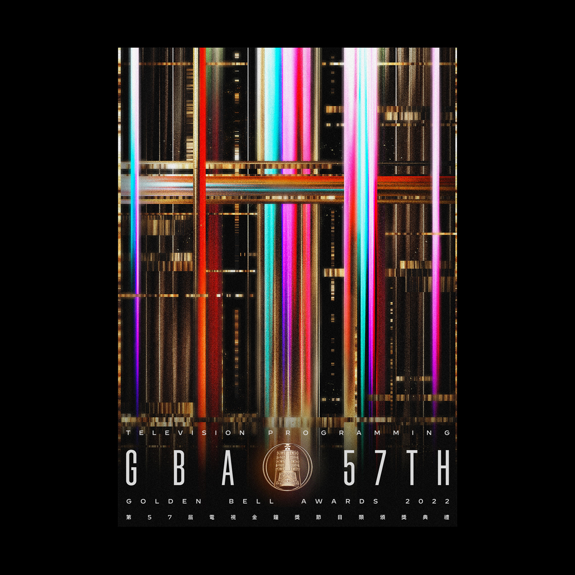
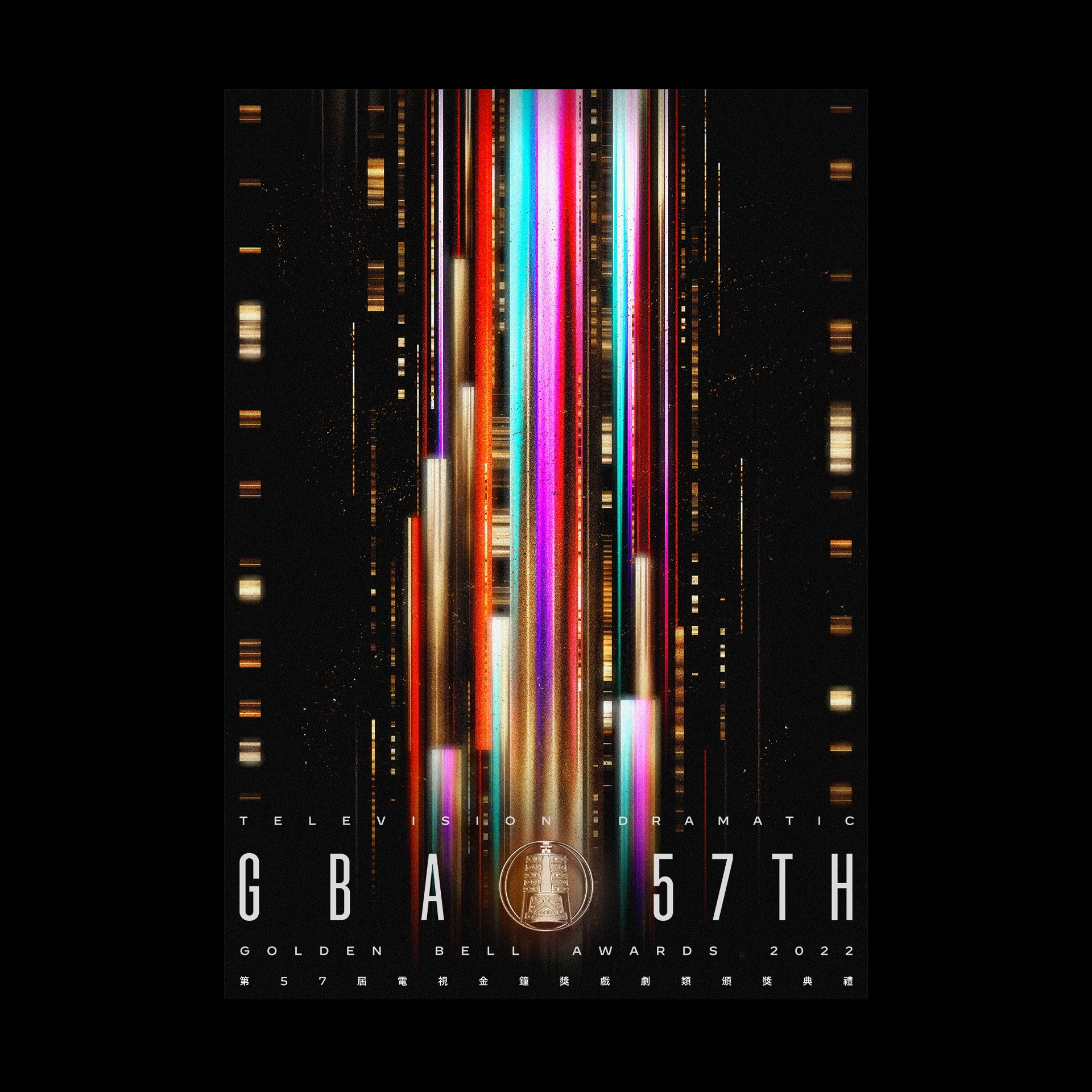
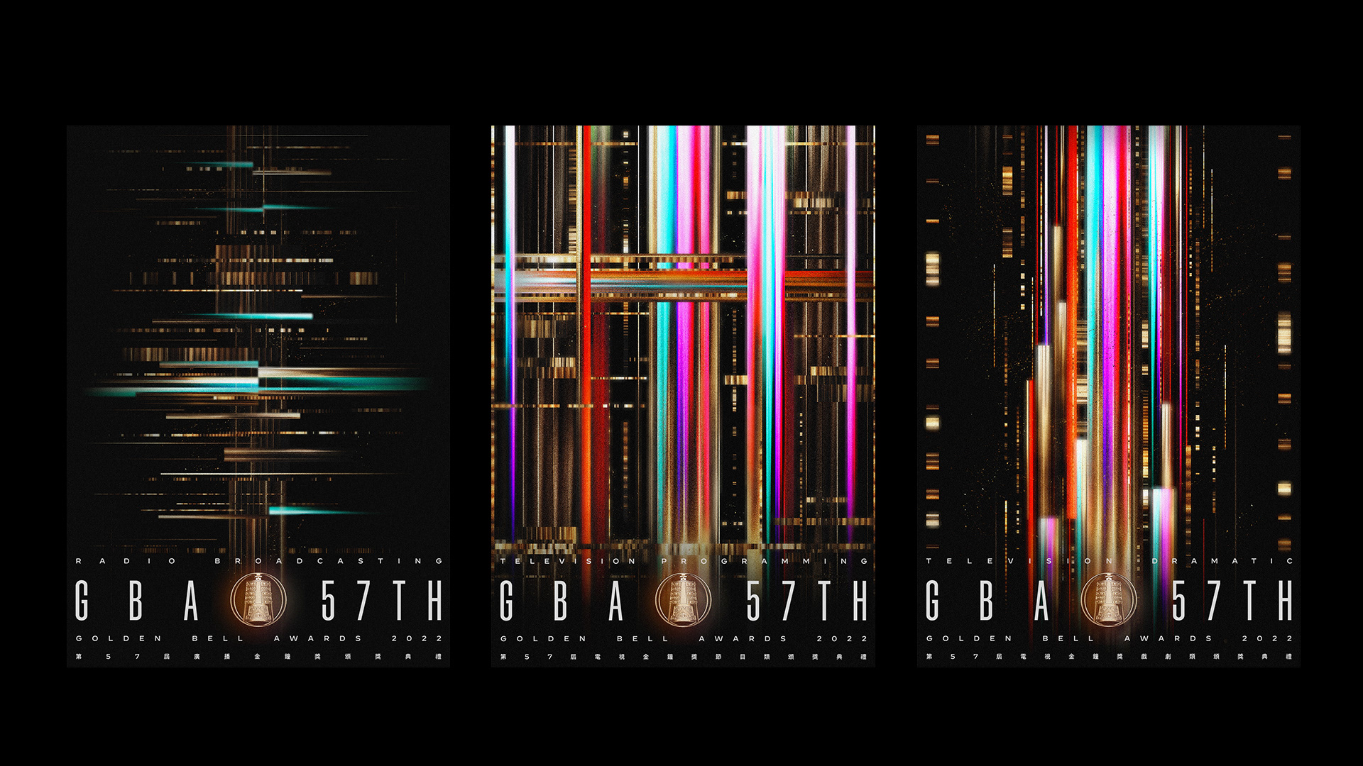
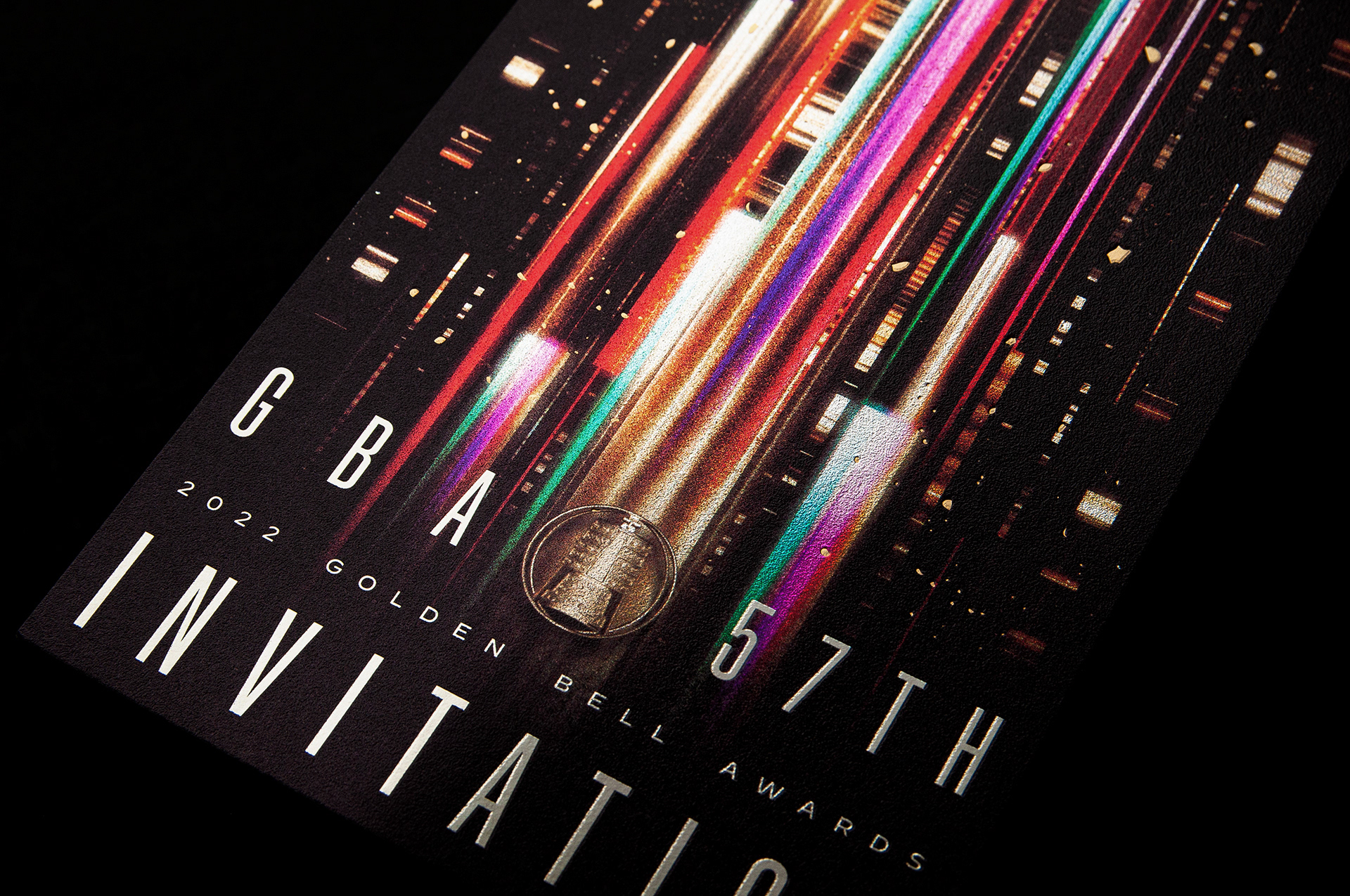
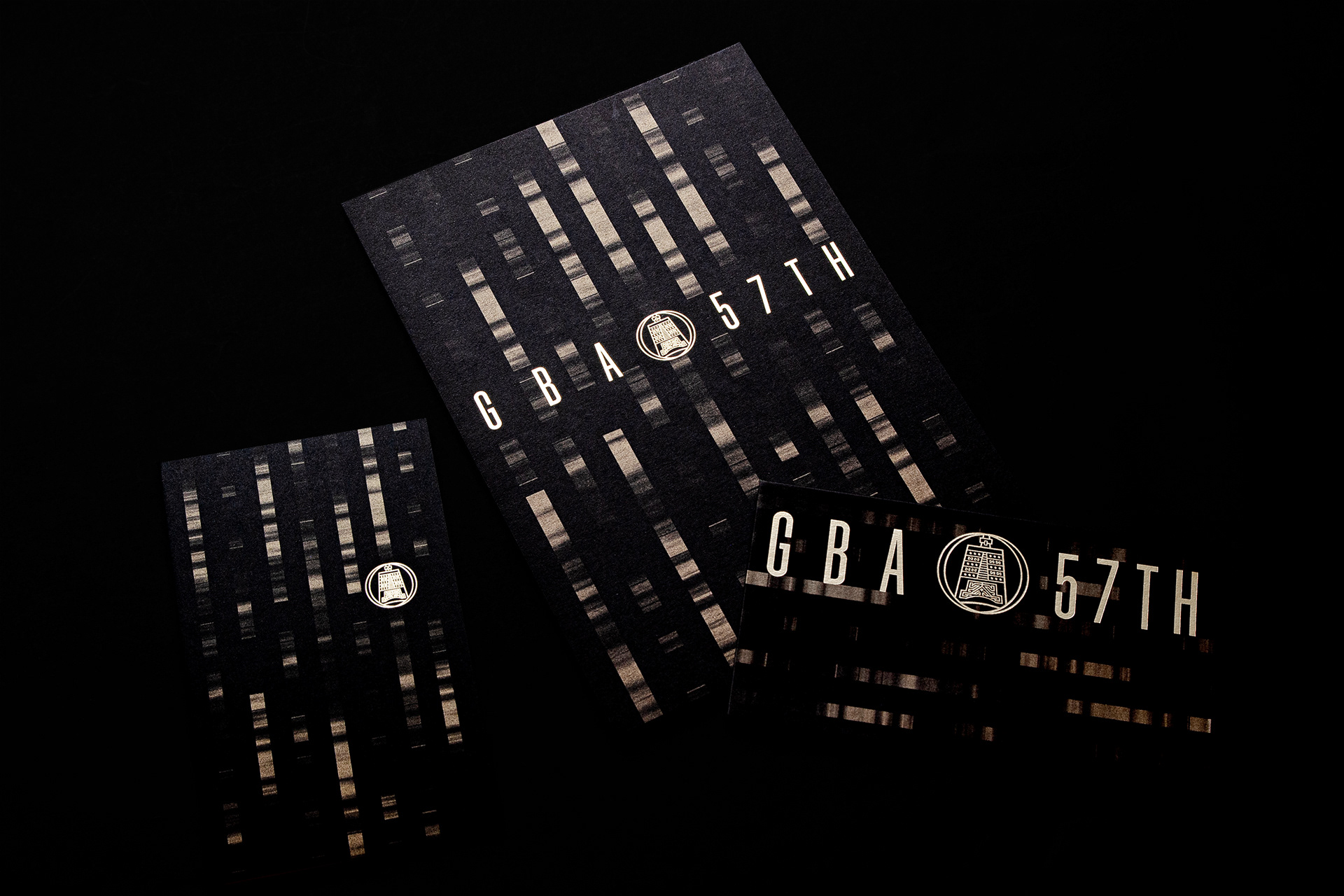
金鐘獎是涵蓋廣播、節目、戲劇三場典禮的大型活動。除須具一個主軸概念、開展符合三場特質的系列視覺之外,尚須規劃一組識別系統,供整體活動、前導行銷與三場共用的製作物使用,需高度整合的設計規劃思考。GBA57 以數據流 Data Flow 符碼結合金鐘品牌 Icon 與年度設計標準字,圍繞金鐘為中心向外延伸動態,表現流動、擴大、彈性與影響。
金鐘獎入圍證書 / 封套
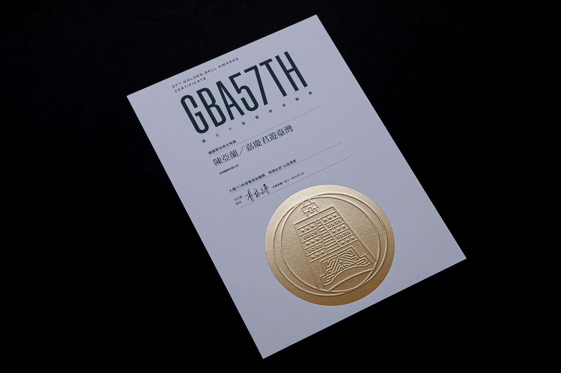
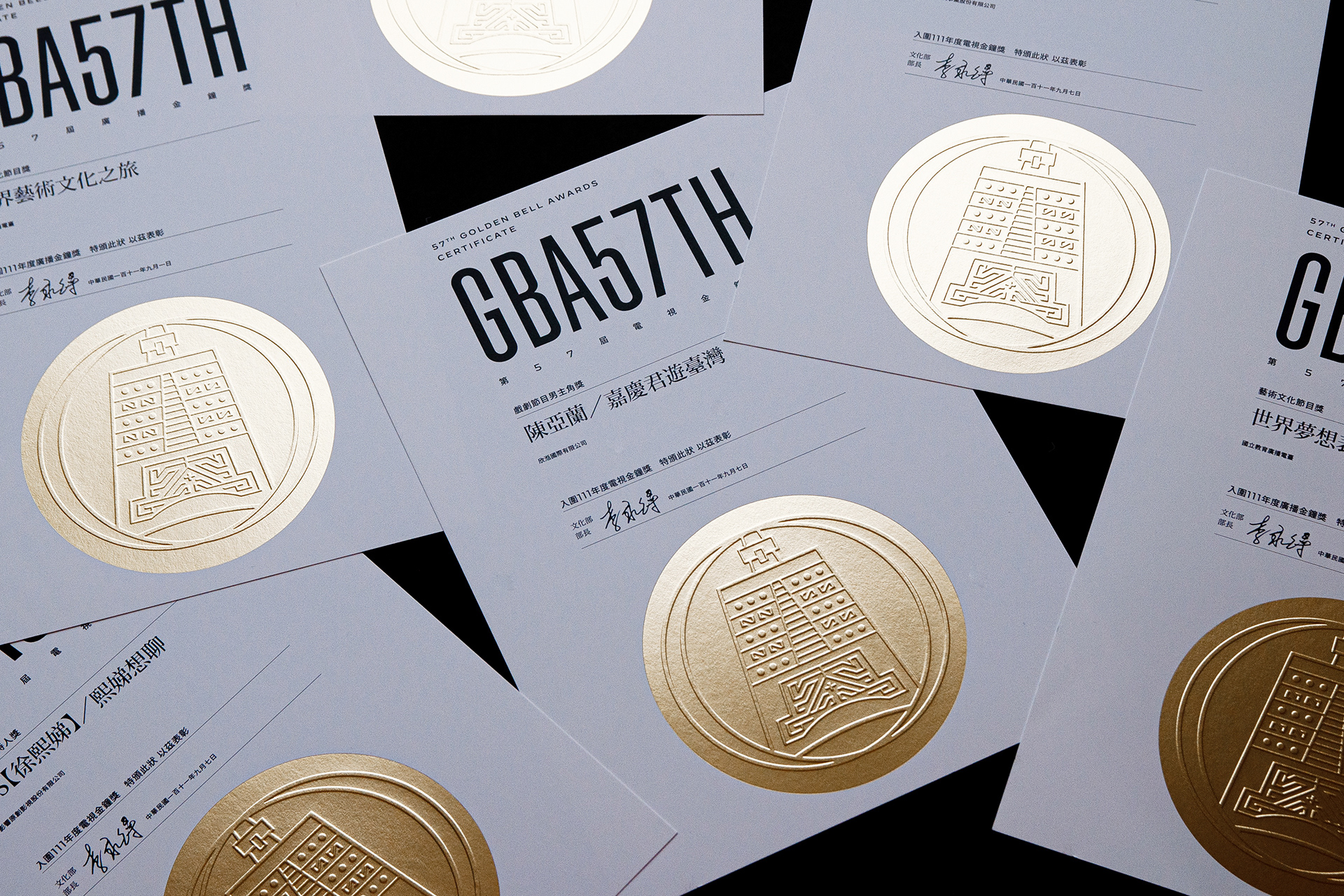
入圍國家級重要獎項是難度極高之事,重新思考入圍證書的定位與規格,投入更多的設計規劃與製作成本,著重字體選擇與排版上的官方正式性,金鐘品牌 icon 以大面積的金色特殊加工表現,提升入圍證書的價值、高度與稀有性,使其成為值得被收藏與備感榮耀的關鍵年度物件。
Visual of the 57th Golden Bell Awards
Creation of the Golden Bell Brand Icon
The purpose of the planning is to rejuvenate the Golden Bell Awards, establish a brand profile for the Golden Bell, and enhance the breadth of its applications. Drawing inspiration from the texture of the "bell" on the trophy, the design is based on a flat style, rational lines, and perfectly symmetrical shapes, imbuing the Golden Bell with simplicity and contemporaneity. This approach aims to open up possibilities for more diverse design, processing, and marketing applications.
The goal is to establish a core brand identity for the Golden Bell Awards, leveraging classic identification to accumulate unique brand value.
The Golden Bell Awards is a large-scale event that encompasses three ceremonies for broadcasting, programs, and drama. In addition to having a central concept and developing a series of visuals that align with the characteristics of the three ceremonies, a cohesive identification system needs to be planned for use by the overall event, prelude marketing, and shared productions for all three ceremonies. The design planning requires a high level of integration.
GBA57 combines data flow codes with the Golden Bell brand icon and annual design standard fonts. The design revolves around the Golden Bell as the center, extending dynamically outward to express flow, expansion, flexibility, and influence.
Visual Concept: (Micro) Patterns of Water → Trends of Flow → Era of Tides (Macro)
With "flow" as the theme, the concept spans from micro to macro to elaborate on the diversity of changes in the industry. It echoes the rapid adjustments and adaptations during the pandemic, contrasting with the industry's recent explosive energy, diverse platforms, and streaming trends. For viewers, we are already immersed in this vast, rapid, open, and dynamic era of film and television.
Golden Bell Awards Nomination Certificate / Cover
Being nominated for a national-level prestigious award is an extremely challenging accomplishment. There is a need to rethink the positioning and specifications of the nomination certificate, investing more in design planning and production costs. The focus is on the official formality of font selection and layout. The Golden Bell brand icon is presented with a large area of special gold processing to enhance the value, prominence, and rarity of the nomination certificate. The goal is to make it a key annual item worthy of collection and a symbol of pride.